 "QUANTUM SHOT" #450 "QUANTUM SHOT" #450link These Marketers Would Use ANYTHING! You never know when some viral urban campaign would come around the corner and whack you with some bizarre message. More interesting ones may even capture your thoughts long after the first visual shock subsides. More often than not, it's just a smart product placement / promotion, but in some cases - truly subversive and genuine urban art. Streets in Portugal seem to be the most often visited by creative mayhem: (once you approach these stabbed victims, they will hand you a promo flyer...) 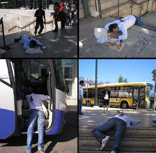 Using shocking faux-death scenes is getting to be quite popular: 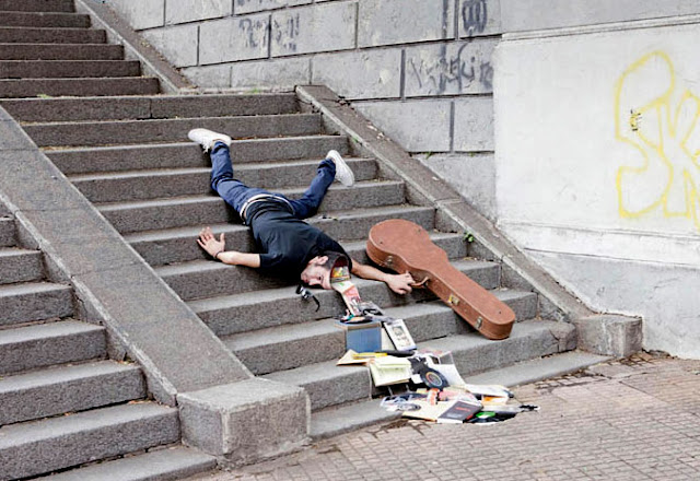 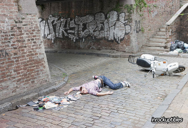 Go on, make your usual grocery trip. You may encounter some sights you did not bargain for - On the street: Begging Sculptures. "My Cathedral Needs Your Help" -  Turning the whole street into a blue river: 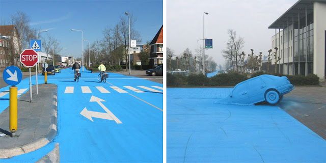 Inside the elevator: 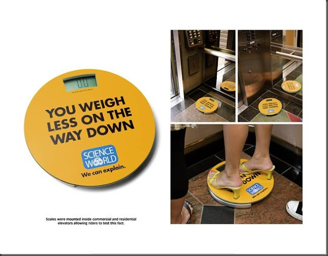 On a street corner: 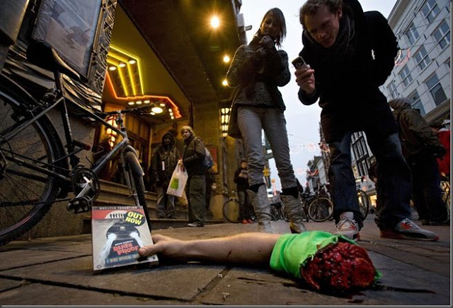 At the supermarket: 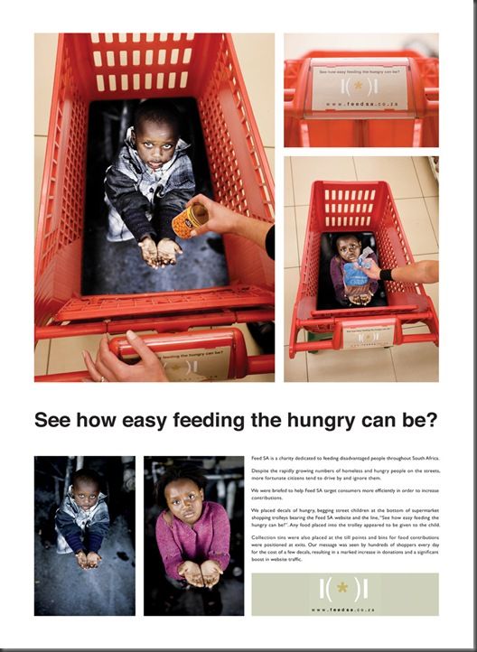 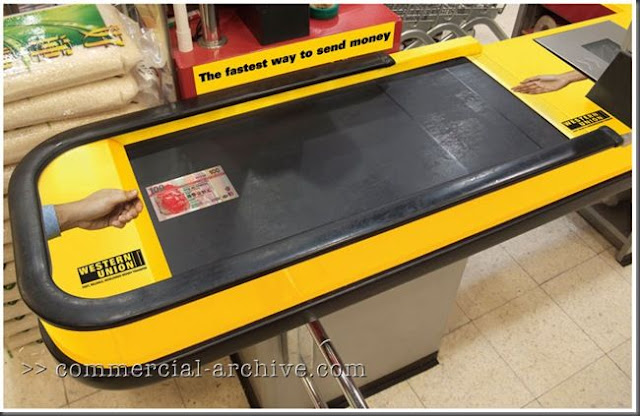  Check out this tongue-in-cheek packaging:  In the washroom: 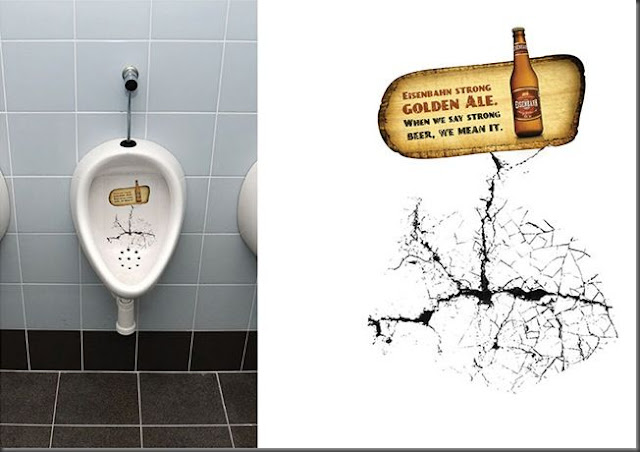 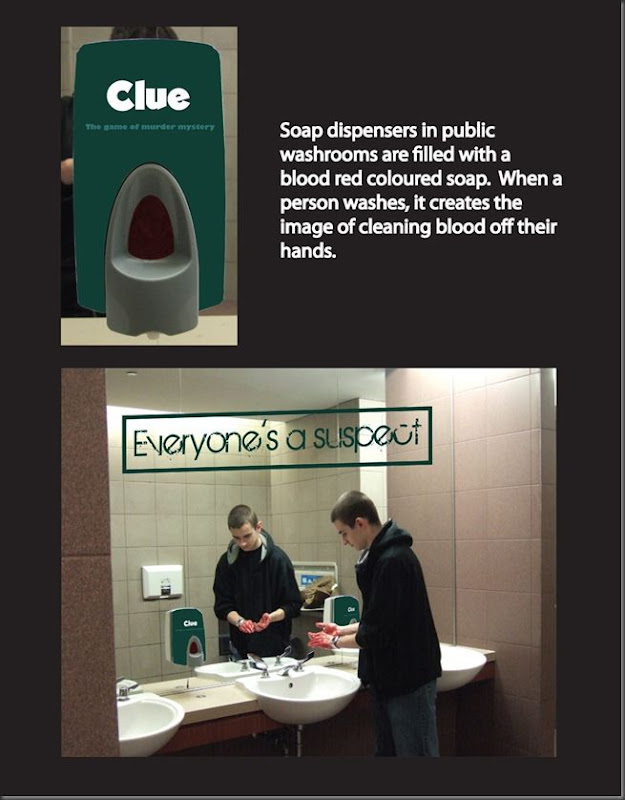  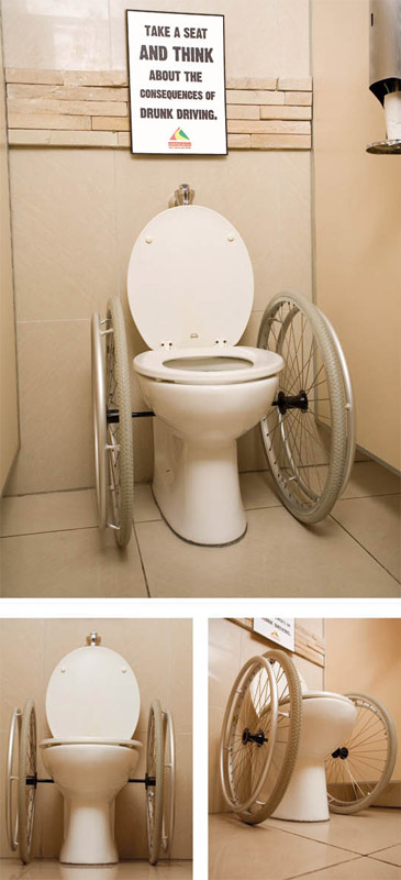 In the swimming pool:  At the train station: 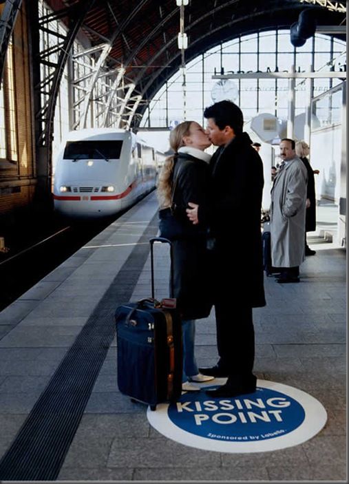 In the tunnels: 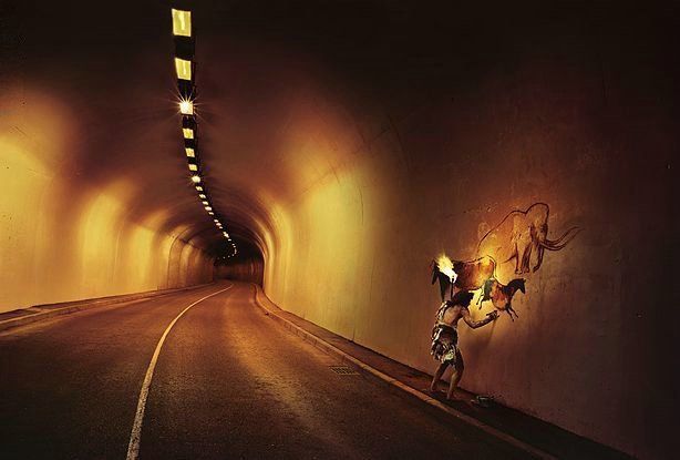 At the bus stop:  In your local park - protesting hippies stuck forever, due to a certain lock: 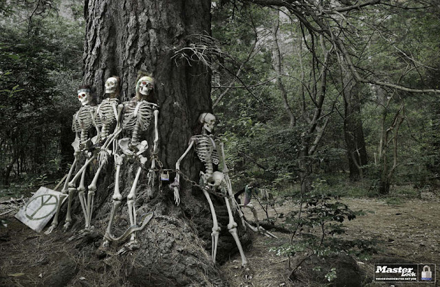 In your kitchen (ingenious ice tray) -  At some Asian restaurant ("Can't hate everything"): 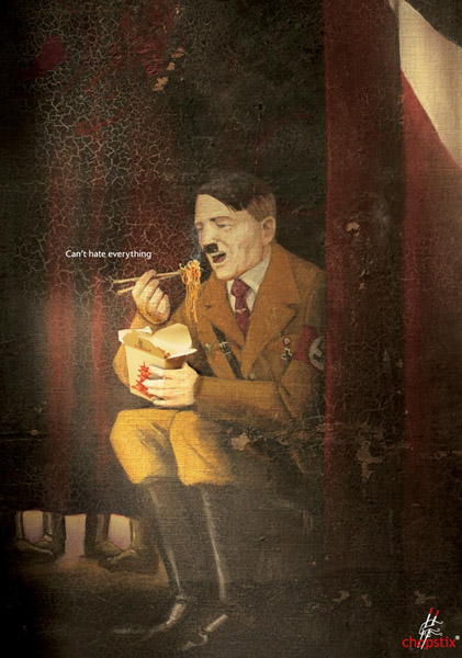 At your local pub - Balancing three pints of Guinness as part of a marketing trick: 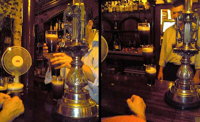 Famous Banksy can use literally any part of street landscape to make his point: 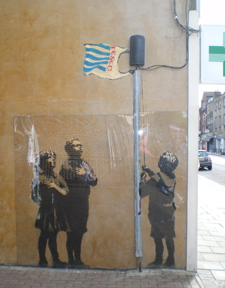 Can't get enough of this marketing campaign... really makes you stop in your tracks and re-consider what you're place in life is, what your job situation is like, and how you're infinitely better off than these poor unfortunate souls (even if your boss is a psychopath). Here is one location that we did not feature before: an soft ice cream machine - 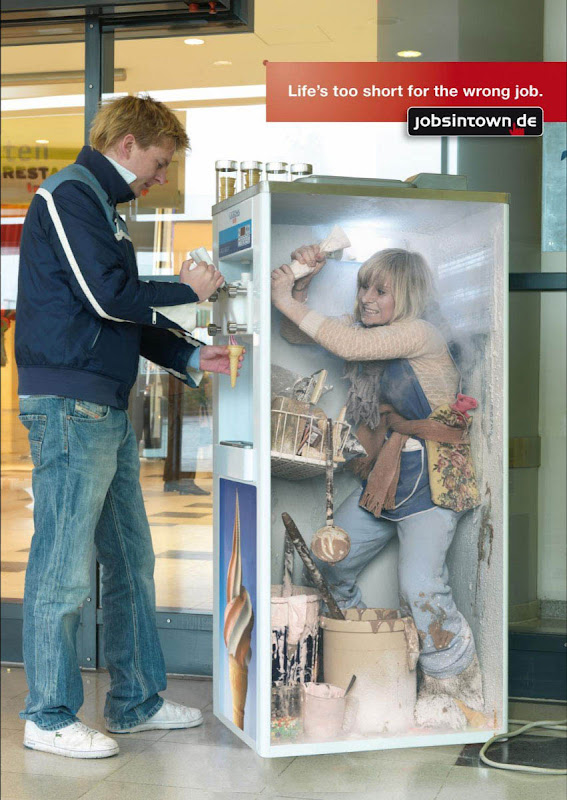 Similar approach: totally freaky vending machine... Get Your Own Goat!! 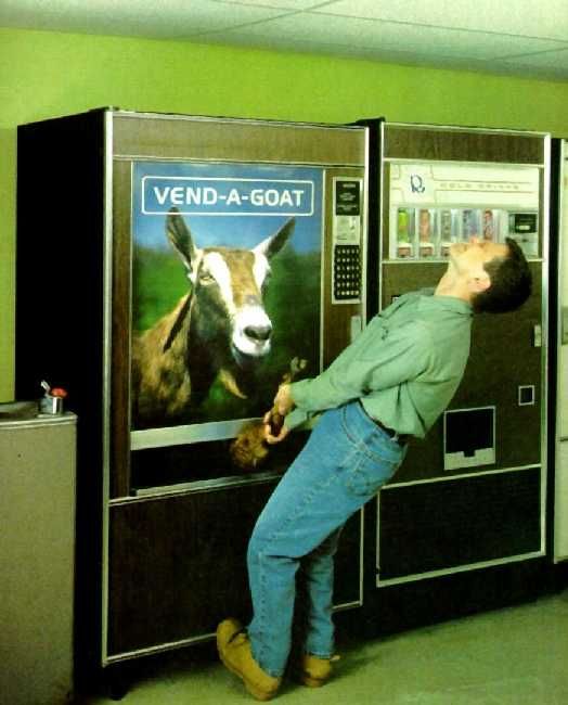 And a priceless idea - An Anger-Release Vending Machine: 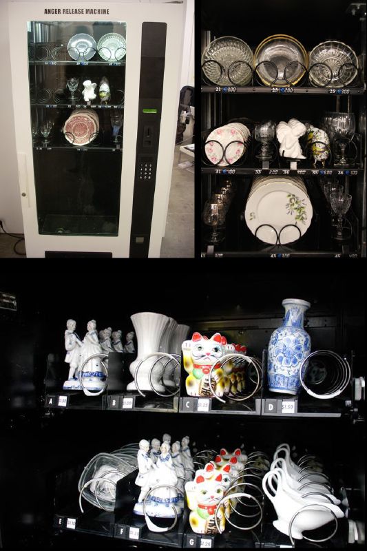 Cool use of a spare wheel: 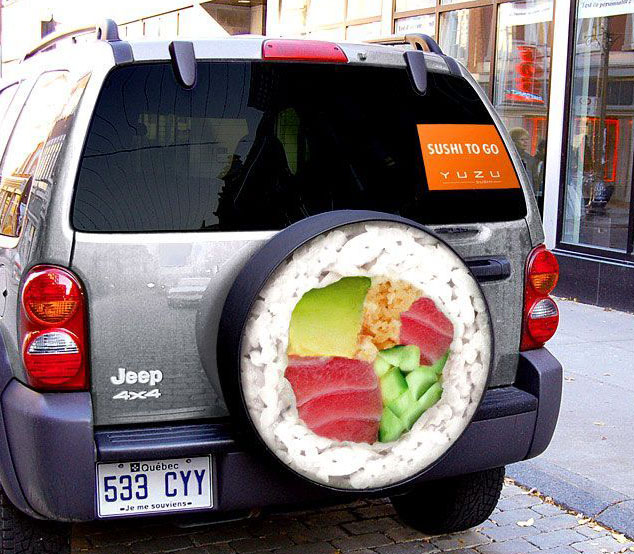 Great play on your traffic woes: 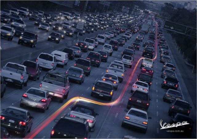 Old and boring billboards can be greatly enhanced, when designers start using other elements of urban environment : Using raised bridges:  Using weird building profile: 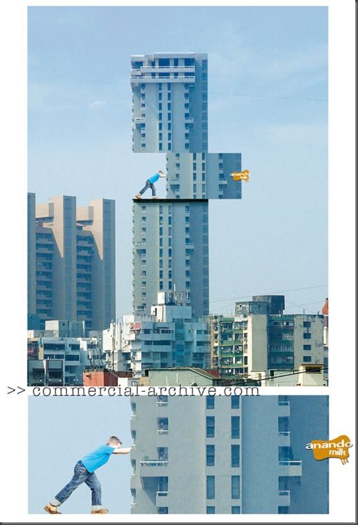 Using the power of wind: 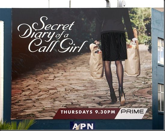 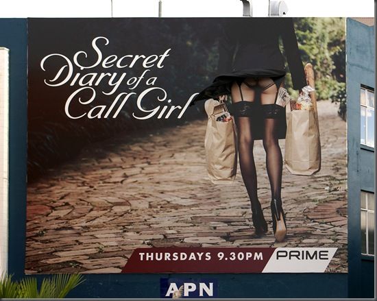 Using old building's corner:  A case of billboard ad gone hilariously wrong, obviously in haste of preparation for Olympics - (somebody used Goggle translation engine, not checking for the language nuances - "World" and "Peace" are the same words in Russian) 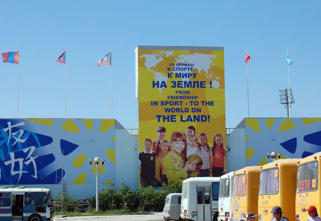 More of the same: 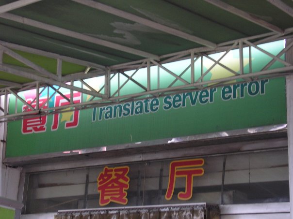 Finally, radically different kind of banner - a subliminal one: 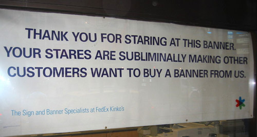 All these ad masterpieces are infinitely removed from the kind we saw in the 70s and 80s: (although these too have some charm, of a different kind)  Even more charming... 1940s recycling ad - 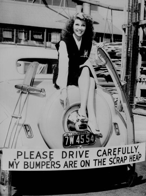 Material is prepared using these sources: Malevi4, Frederik Samuel, Scary ideas READ THE REST OF "COOL ADS" SERIES Permanent Link...  ...+Facebook ...+Facebook Category: Cool Ads Dark Roasted Blend's Photography Gear Picks: |
Sabtu, 19 Juli 2008
Shocking & Creative Ads from the Urban Jungle
Langganan:
Posting Komentar (Atom)
Tidak ada komentar:
Posting Komentar